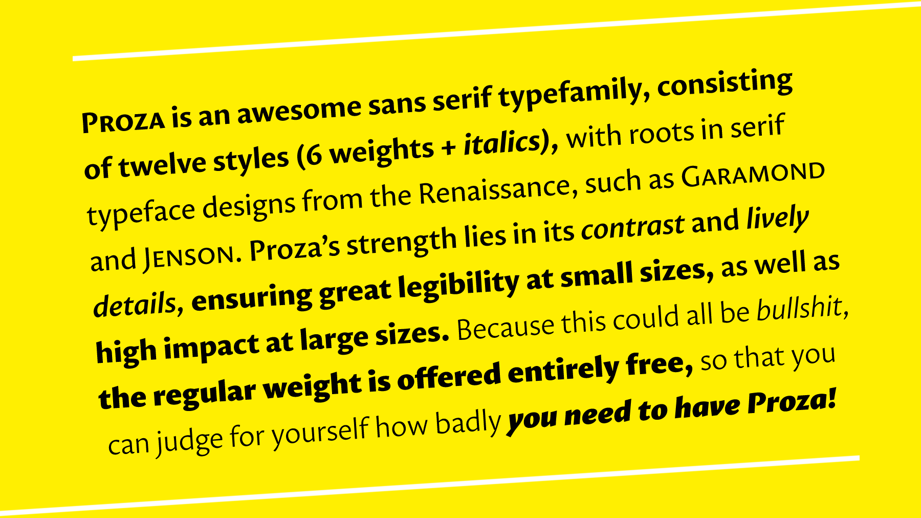
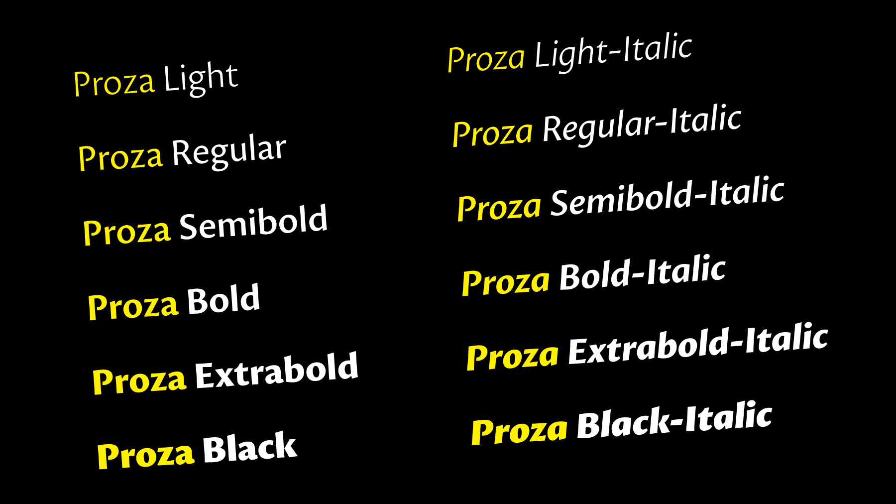
Proza is a humanist sans serif typefamily, consisting of 12 styles (6 weights + italics), with roots in serif designs from the Renaissance, such as Garamond and Jenson. Proza was made to function well at a large range of sizes, from the smallest of text sizes, to gigantic posters, making it a highly versatile typefamily. Its large character set (support for 200+ languages) and opentype features do all the heavy lifting for you, while its elegance and refined details ensure to deliver a punch of class to your designs.
Proza is only offered in .otf format, which is a cross-platform format, offering a maximum of technical capabilities. If you are not yet convinced that you want Proza very badly, I recommend downloading the regular weight for free (underneath), or downloading and preferably printing the pdf specimen (underneath). A detailed article about the long process that lead to the final design of Proza on ilovetypography.com can be found here.
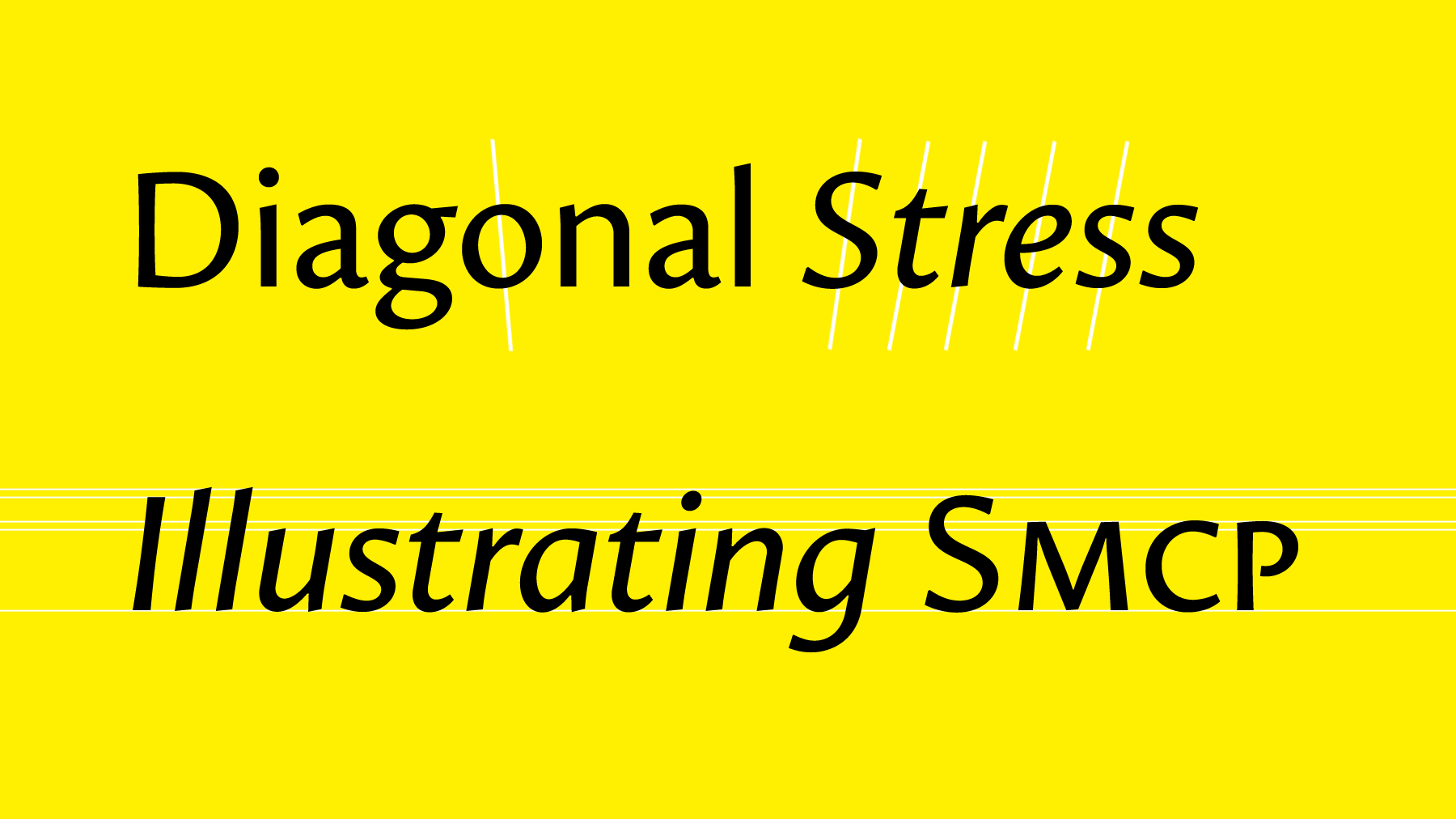
One of Proza's most defining character traits is its diagonal stress (the thin parts of each letter are placed diagonally, rather than vertically). This trait is one of the influences of the broad-nip pen. The italics are not just slanted, but completely redesigned in order to differentiate just enough from the uprights, while maintaining unity. The italic capital letters are slanted slightly less than the small letters, to ensure good-looking all-caps settings as well creating a more dynamic structure. The x-height is not too high, nor too low, aiding legibility in large chunks of text. The capital letters are slightly smaller than the ascenders, which also aids legibility by differentiating more clearly between capitals and small letters, especially helpful in words like ‘Illustration'.
Proza makes extensive use of ‘ink-traps', a little trick to make sure the ink doesn't flood on the insides of joints. Furthermore, many of its strokes are tilted at a small angle to bring the outlines alive, and create a more appealing design. The ‘counters' (the insides of letters) are very open in letters like e, a, and s, which is good for legibility. Details like these, and more, are what makes Proza functional and appealing at both text and display sizes.
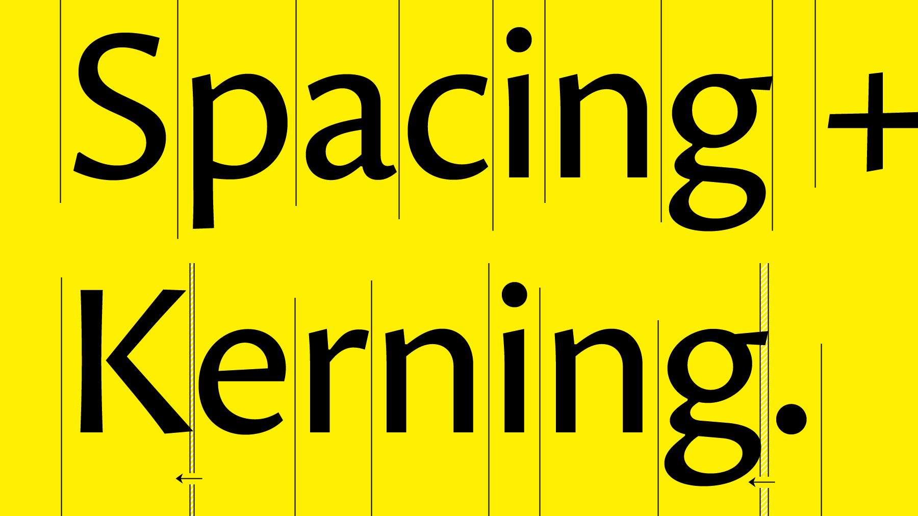
Spacing and kerning are the processes behind the distances between letters. I could explain all the technical ins and outs, but all you need to know is that Proza has been spaced and kerned meticulously, and every letter combination has been taken care of, which is very important for legibility as well as a balanced texture.
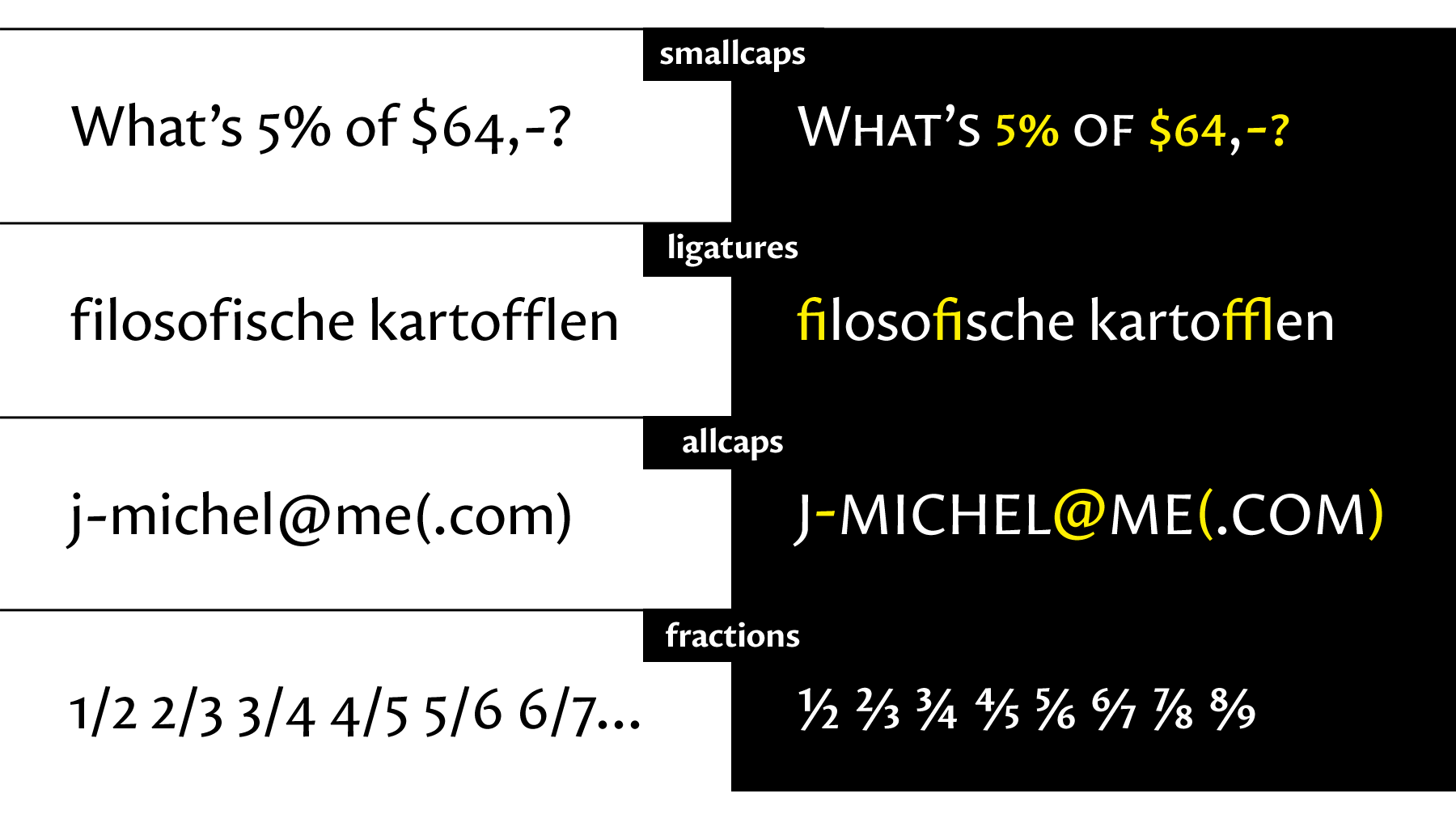
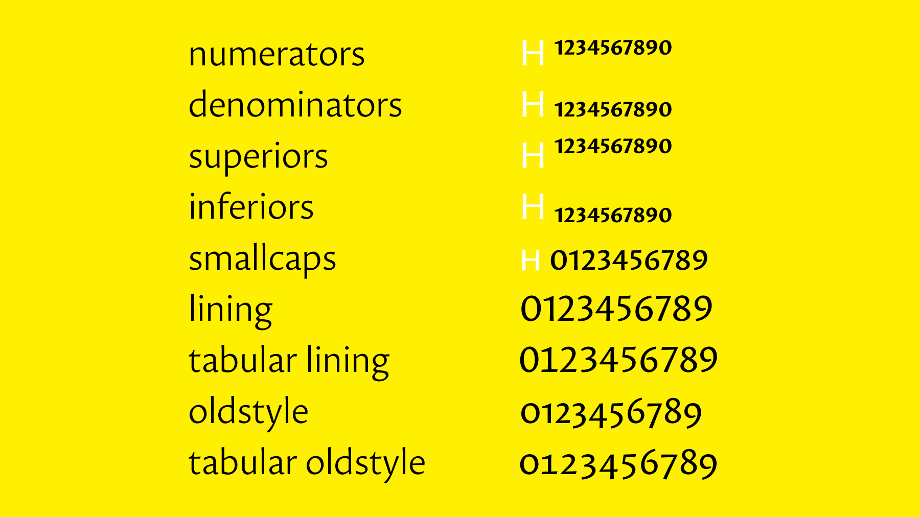
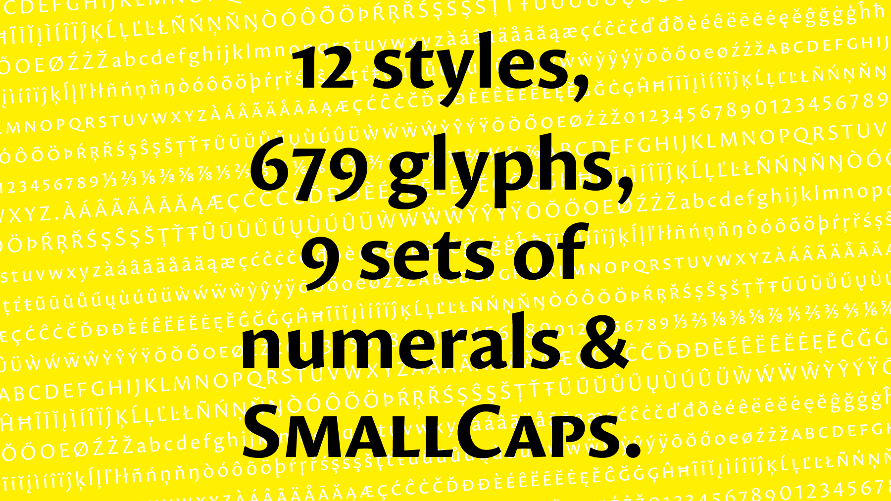
Proza contains a set of very useful opentype features, as displayed in the pictures above. They help improve your designs, and save time. In case you're not familiar with opentype features, they automatically (once switched on) replace glyphs or sets of glyphs by other glyphs, such as replacing 1/2, by a properly designed fraction. Proza contains fractions, and nine sets of numerals.
Oldstyle figures are mostly used in running text, lining figures are more modern and stand out more, while tabular figures have monospaced widths (each glyph has the same width, also between styles). A special set of figures has been designed to work fluently with the smallcaps. Numerators, denominators, superiors and inferiors finish the list. If you have any further questions about Proza, feel free to get in touch.
