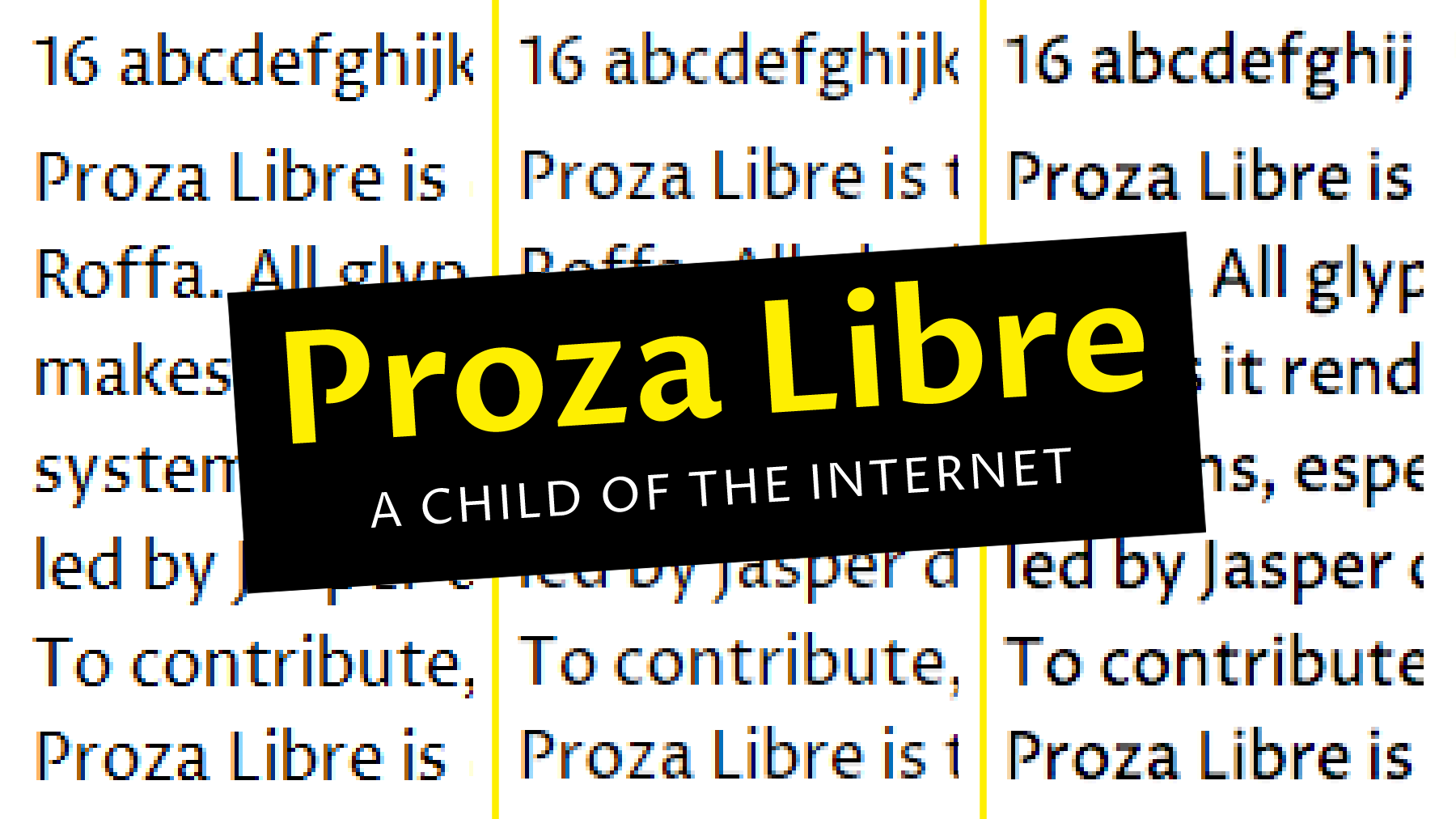
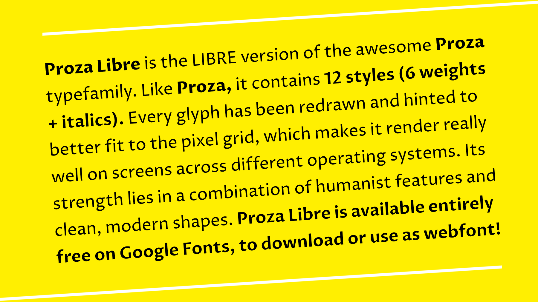
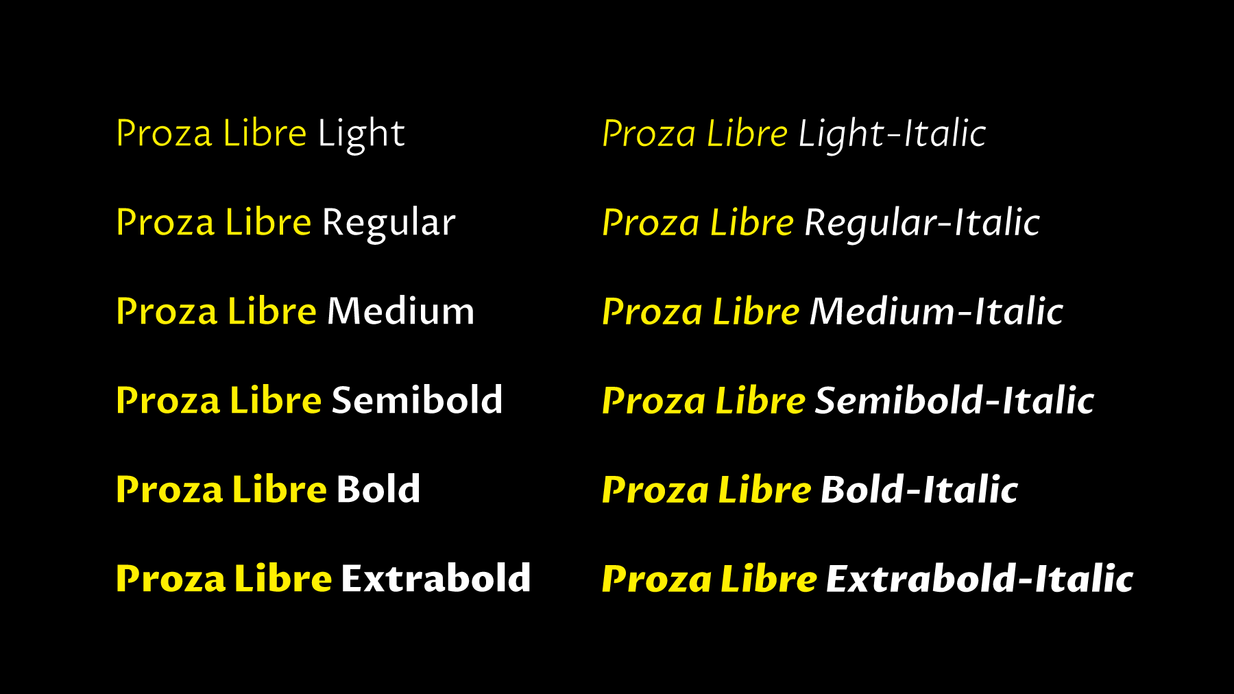
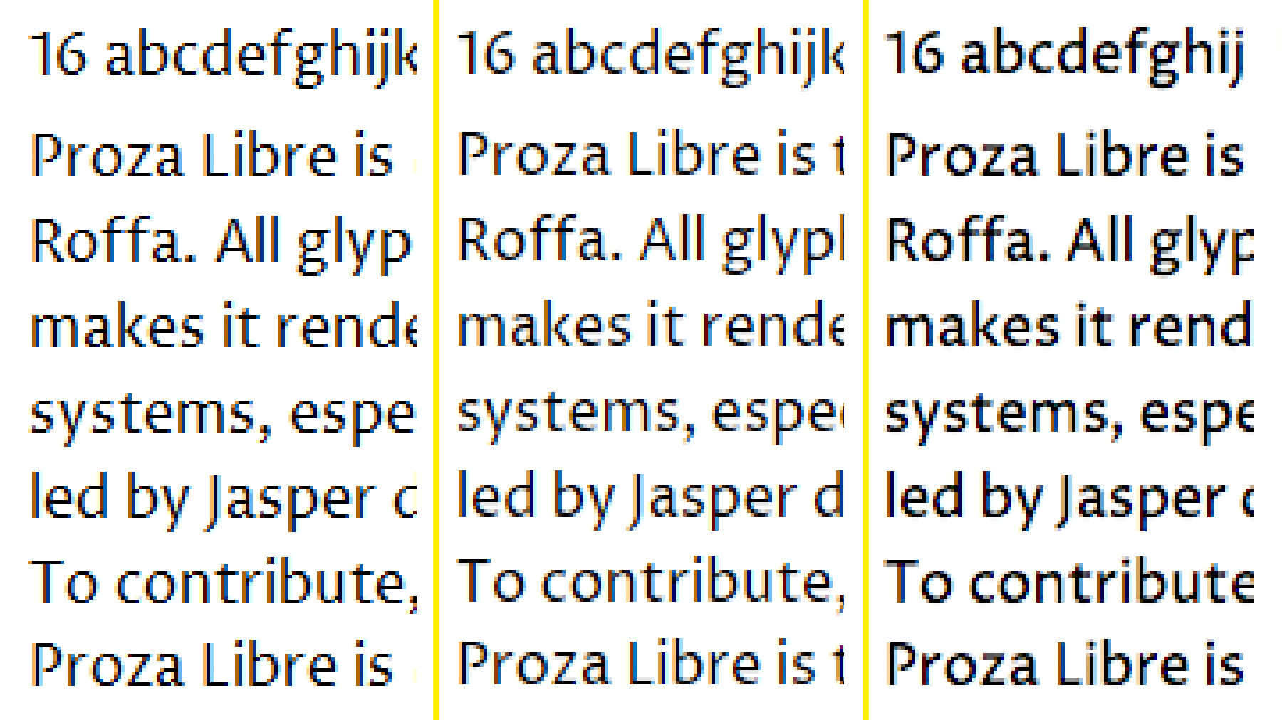
Proza Libre is the libre version of the Proza typefamily. Like Proza, it contains 12 styles (6 weights + italics). Every glyph has been redrawn and hinted to better fit to the pixel grid, which makes it render optimally on screens across different operating systems. Its strength lies in a combination of humanist features and clean, modern shapes.
For any webfont it is essential that it is hinted properly. Proza Libre was hinted semi-automatically using ttfautohint. Hints were generated automatically and then manually adjusted for the best result. Proza Libre is an open source project, so typedesigners are invited to contribute to the project here.
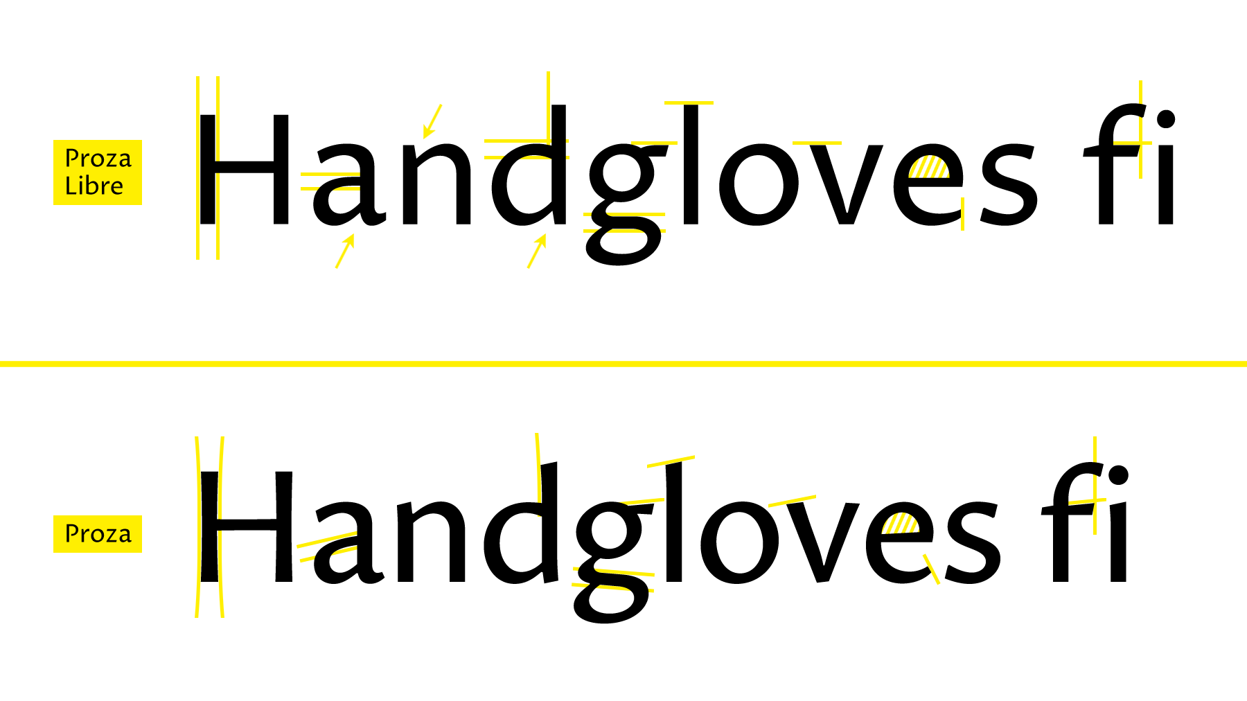
Because hints have no effect on the appearance of a webfont on a Mac, every glyph was redrawn, to better suit the limitations of the pixel grid. The outward curve on the top-left of stems and the diagonal cut on the top were cut off. In the uppercase, the slight broadening of the stems toward the ends was straightened. Overall, Proza Libre is lighter and spaced more generously. Special attention was given to the whitespace on the outside of where curves meet stems (indicated with arrows), making them big enough to remain clearly visible, even at small sizes.
Many diagonal elements were replaced by horizontal lines, such as the middle part of ‘a' and ‘g'. To prevent ugly collisions when ligatures are turned off (which is often the case on the web), the top of the ‘f' is moved to the left, allowing it to work better when followed by an i or an l, and the diagonal part of the horizontal bars in f, g, and t s straightened. The ‘ear' of g has a slight indent, to stop it from mingling with the ‘eye' (circular part) too much. The base of the v is broadened, since the joint otherwise gets very dark at small sizes.